Meme Analyzer, 2021,
Design & Data Visualization
Data Visualization, Meme Research
Meme Analyzer is a research-oriented visualization prototype developed to support the study of how internet memes emerge, evolve, and circulate across platforms. The project visualizes a labeled image database through an accessible interface that allows researchers to identify patterns, track changes over time, and analyze platform-specific contexts.
This project was a collaboration between the Digital Democracies Institute at Simon Fraser University and the Public Visualization Lab at York University. The Digital Democracies Institute developed a machine-learning system and database designed to detect, group, and track memes circulating online. Using automated similarity detection, the system identifies both identical memes and related memes that share common templates, categorizing them into a reference archive for research purposes.
The work involved conceptualizing and designing the front-end visualization layer of the database, with a focus on developing visual features and interaction tools that enable researchers—particularly non-programmers—to effectively navigate, organize, and interrogate the dataset. A preliminary prototype was also developed to serve as a proof of concept and a foundation for future development.
The meme archive was labeled and structured using CSV-based metadata, including categorical and temporal information. The visualization system was designed to work directly with these datasets, translating raw tabular data into interactive visual structures. A key design constraint was accessibility: the interface needed to support advanced analytical tasks without requiring technical or programming expertise.
The prototype was designed to support exploratory research questions such as: How do memes change over time? How does platform context influence the meaning or form of a meme? What patterns emerge in the reuse or mutation of meme templates? To address these questions, the interface prioritizes flexible organization, filtering, and comparison tools that allow researchers to trace meme origins, identify trends, and examine transformations across platforms and time.
The resulting prototype serves as both a functional visualization database and a proof-of-concept research tool. It was developed to support grant applications and future funding aimed at expanding the system into a fully realized research platform, incorporating additional analytical tools and larger datasets.
Role: Designer & Developer (Graduate Research Assistant)
Organization: Public Visualization Lab (York University)
Technology: D3.js, CSS, HTML, JavaScript, Adobe XD
Researching Image-based Research Papers
The first stage of the project was to identify required functions and to review how researchers have previously examined image archives and produced data visualizations. Many of the reviewed papers focused on emergence and proliferation, as well as on identifying dominant subject matter shared within online communities.
Prior research also examined how archived image datasets can be used to track the spread of visual content across platforms. Temporal analysis was frequently highlighted as an important method in meme research, particularly when combined with external contextual data such as trending news topics, to understand how memes emerge in response to world events. Some studies also analyzed posting frequency to identify highly active or influential users and communities.
Across both research papers and archival projects, there was consistent interest in the historical context and evolution of memes. Existing resources such as Know Your Meme demonstrate the value of providing background and contextual information alongside image archives.
Additional research was reviewed that focused on image feature analysis within large databases not specific to memes. A short list of selected papers, along with research notes, is included at the bottom of this page.

Inspiration and Wireframe Prototype
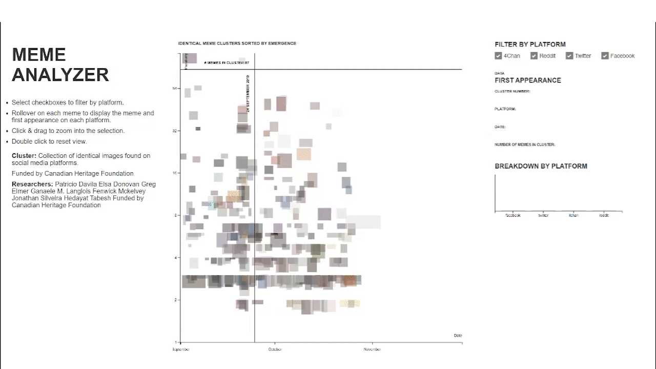
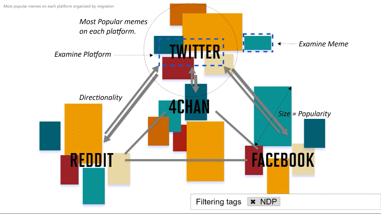
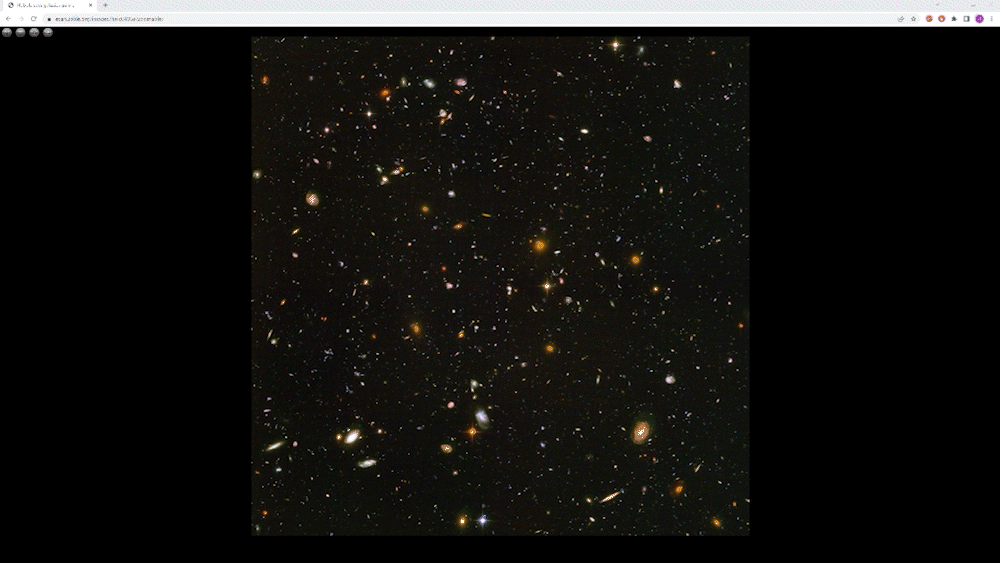
The visualization and interface were inspired by esaHubble.com’s zoomable image feature, which allows users to examine extremely large images from the Hubble telescope. At the initial level, the visualization presents a broad overview of each platform. As users focus on specific areas, more detailed information emerges. The top levels highlight platform-wide patterns, including the most popular memes and directional indicators showing how memes migrate between platforms. Deeper exploration within each platform reveals meme movement between subgroups or boards. The application also supports timeline comparisons of individual meme variations, illustrating how a meme evolves over time or changes as it spreads across social media applications. Additional tracked information includes the number of images in a cluster, posting dates, and the communities or platforms involved. A UI prototype created in Adobe XD can be tested below.

The visualization was developed using HTML, JavaScript, and D3.js. A small set of features was prioritized due to the project’s time constraints. The focus was on identical meme clusters, sorted by their first appearance on each platform, as well as the emergence of variations across platforms. Images were processed for average color and size to support the graph visualization. The graph itself is organized by popularity and date. When users hover over an image, additional information is displayed, including the first appearance, the number of images in the cluster, and a bar graph showing the platforms where the meme is most popular. Examples of the visualization are available below.